Flutter Layout Basics - Card#
Card, a card-style layout with rounded corners and shadows. It is usually used to display associated information, such as album information, coordinates, contact information, etc.
Using Card#
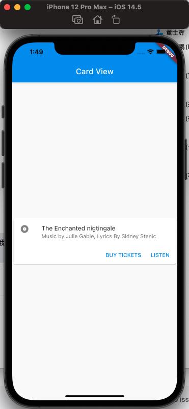
Let's take a look at how to create a common list element widget. It consists of an Icon on the left, a title above, a description, and a button at the bottom, commonly seen in order lists.
The desired effect is as follows:
Now let's see how to implement it:
ListTile#
Here, let's introduce ListTile, a fixed-height widget provided by Flutter that can have an Icon and text on the left or right side.
It can achieve the following effect:
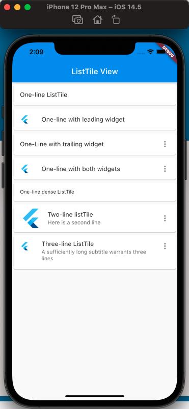
The code is as follows:
class MyApp extends StatelessWidget {
  @override
  Widget build(BuildContext context) {
    return MaterialApp(
      home: Scaffold(
        appBar: new AppBar(
          title: new Text('ListTile View'),
        ),
        body: ListView(
          children: [
            Card(
              child: ListTile(
                title: Text('One-line ListTile'),
              ),
            ),
            Card(
              child: ListTile(
                leading: FlutterLogo(),
                title: Text('One-line with leading widget'),
              ),
            ),
            Card(
              child: ListTile(
                title: Text('One-Line with trailing widget'),
                trailing: Icon(Icons.more_vert),
              ),
            ),
            Card(
              child: ListTile(
                leading: FlutterLogo(),
                title: Text('One-line with both widgets'),
                trailing: Icon(Icons.more_vert),
              ),
            ),
            Card(
              child: ListTile(
                title: Text('One-line dense ListTile'),
                dense: true,
              ),
            ),
            Card(
              child: ListTile(
                leading: FlutterLogo(
                  size: 56.0,
                ),
                title: Text('Two-line listTile'),
                subtitle: Text('Here is a second line'),
                trailing: Icon(Icons.more_vert),
              ),
            ),
            Card(
              child: ListTile(
                leading: FlutterLogo(),
                title: Text('Three-line ListTile'),
                subtitle:
                    Text('A sufficiently long subtitle warrants three lines'),
                trailing: Icon(Icons.more_vert),
                isThreeLine: true,
              ),
            )
          ],
        ),
      ),
    );
  }
}
The above code introduces the usage of ListTile and covers it comprehensively.
Now let's take a look at the initial desired effect, divided into known basic widgets as follows:
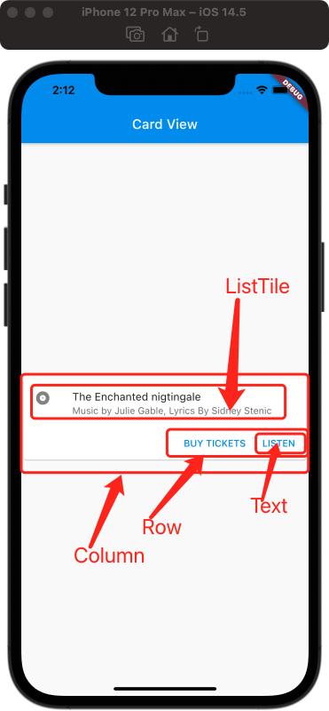
The Icon, title, and description on the right can be achieved using the ListTile introduced above. The single button at the bottom can be implemented using TextButton (oh, it hasn't been introduced yet, wait a moment for another article, for now, you can use Text), and the two buttons can be horizontally aligned using Row. The vertical layout of ListTile and Row can be achieved using Column, and finally, wrap them all in a Card. Therefore, the final code is as follows:
class MyApp extends StatelessWidget {
  const MyApp({Key? key}) : super(key: key);

  static const String _title = 'Card View';

  @override
  Widget build(BuildContext context) {
    return MaterialApp(
        title: 'Card View',
        home: Scaffold(
          appBar: new AppBar(title: new Text(_title)),
          body: const MyStatelessWidget(),
        ));
  }
}

class MyStatelessWidget extends StatelessWidget {
  const MyStatelessWidget({Key? key}) : super(key: key);

  @override
  Widget build(BuildContext context) {
    return Center(
      child: Card(
        child: Column(
          children: [
            const ListTile(
              leading: Icon(Icons.album),
              title: Text('The Enchanted Nightingale'),
              subtitle: Text('Music by Julie Gable, Lyrics By Sidney Stenic'),
            ),
            Row(
              mainAxisAlignment: MainAxisAlignment.end,
              children: [
                TextButton(onPressed: () {}, child: Text('BUY TICKETS')),
                SizedBox(
                  width: 8,
                ),
                TextButton(onPressed: () {}, child: const Text('LISTEN')),
                SizedBox(width: 8),
              ],
            )
          ],
          mainAxisSize: MainAxisSize.min,
        ),
      ),
    );
  }
}
The final result will be the same as the desired effect above. Pay attention to the usage of Card, which is usually combined with other collection widgets such as Column or Row to achieve the desired layout.
References#
Card Dev Doc
ListTile Dev Doc
Flutter Free Video Season 3 - Layout