Flutter Component Basics - Image#
Image is a component in Flutter used for displaying images. It is similar to UIImageView in iOS and can load resource images, network images, and local images. It also allows setting of stretching modes and repeat patterns.
Image Loading Methods#
There are several methods for loading images in Flutter using the Image component:
- Image.asset: Loads a local image, such as an image bundled with the project.
- Image.file: Loads an image from the device, such as an image stored locally.
- Image.memory: Loads an image from memory.
- Image.network: Loads a network image.
Here are the usage examples for each method:
Image.asset(name)is equivalent toImage(image: AssetImage(name))Image.file(path)is equivalent toImage(image: FileImage(File(path)))Image.network(url)is equivalent toImage(image: NetworkImage(url))Image.memory(list)is equivalent toImage(image: MemoryImage(list))
Additionally:
When using asset images, the images are packaged in the APK or IPA, which can increase the package size.
Loading time comparison: NetworkImage > FileImage > AssetImage > MemoryImage
Image.asset#
To load a local image in Flutter, refer to Adding assets and images. Follow these steps:
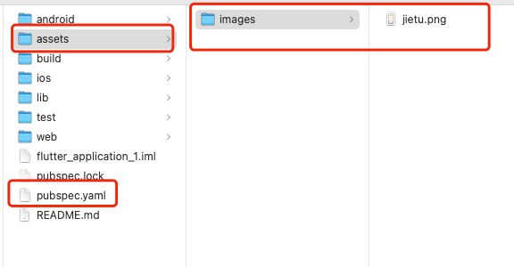
- Locate the
pubspec.yamlfile and find the section that says# To add assets to your application, add an assets section, like this:. Uncomment the lines below it. Pay attention to the formatting of the YAML file. - Create an
assetsfolder parallel to thepubspec.yamlfile and place the images inside it. - Edit the uncommented lines in the file from step 1 to include the path to the images. Note that the path should include the outermost
assetsfolder. Here's an example:
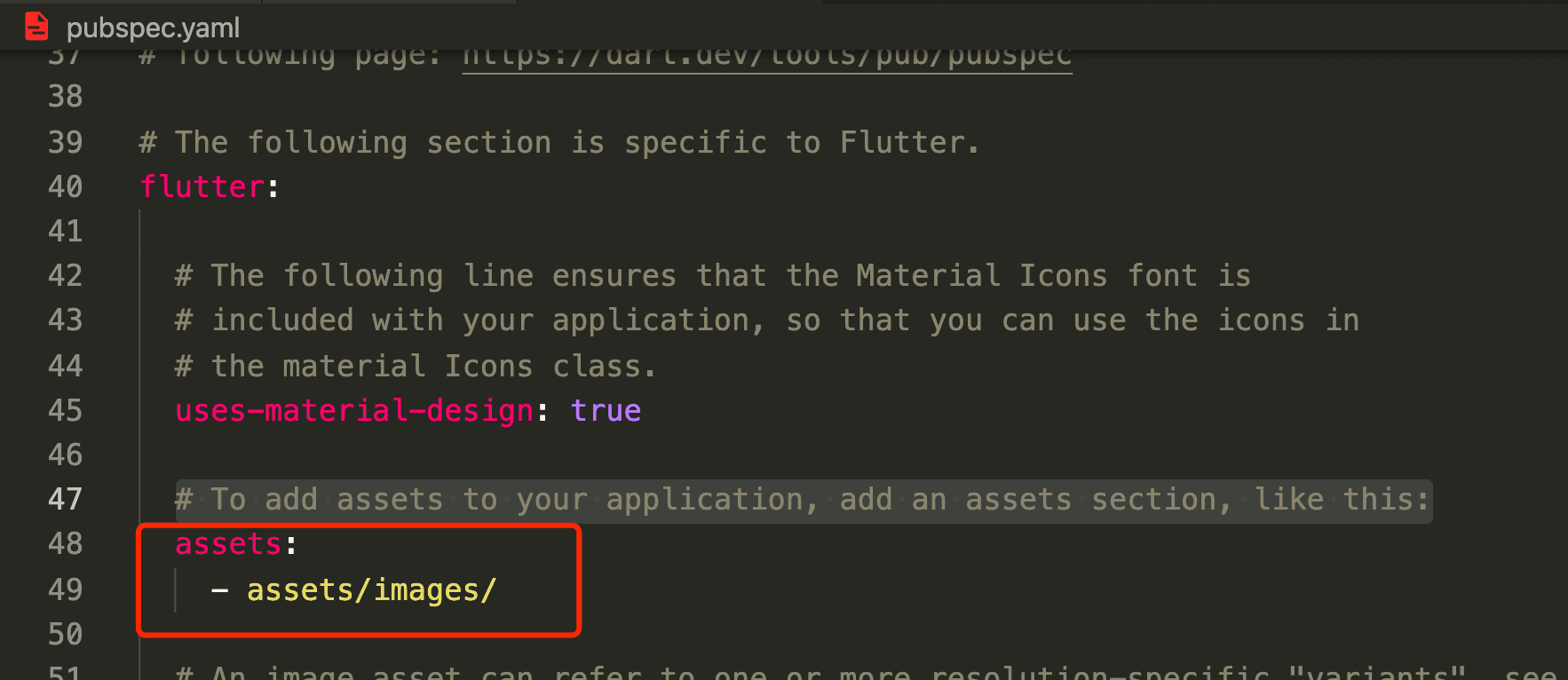
After successfully adding the assets, when using them, make sure to specify the path starting from assets. Here's an example code:
class MyApp extends StatelessWidget {
  @override
  Widget build(BuildContext context) {
    return MaterialApp(
      title: 'Text Widget',
      home: Scaffold(
        body: Center(
          child: Container(
            child: new Image.asset('assets/images/jietu.png'),
            // child: new Image(
            //   image: AssetImage('assets/images/jietu.png'),
            // ),
            width: 300.0,
            height: 200.0,
            color: Colors.lightBlue,
          ),
        ),
      ),
    );
  }
}
Image.network#
To load a network image, use the following code:
class MyApp extends StatelessWidget {
  @override
  Widget build(BuildContext context) {
    return MaterialApp(
      title: 'Text Widget',
      home: Scaffold(
        body: Center(
          child: Container(
            child: new Image.network(
              'https://inews.gtimg.com/newsapp_ls/0/13792660143/0.jpeg',
            ),
            width: 300.0,
            height: 200.0,
            color: Colors.lightBlue,
          ),
        ),
      ),
    );
  }
}
Image Properties#
Here are some commonly used properties of the Image component:
- alignment: Specifies the alignment of the image relative to its parent widget. The effect is visible when the image size is smaller than the parent widget size.
- topLeft: Aligns the image to the top left.
- topCenter: Aligns the image to the top center.
- topRight: Aligns the image to the top right.
- centerLeft: Aligns the image to the center left.
- center: Aligns the image to the center.
- centerRight: Aligns the image to the center right.
- bottomLeft: Aligns the image to the bottom left.
- bottomCenter: Aligns the image to the bottom center.
- bottomRight: Aligns the image to the bottom right.
- color: When not null, blends each pixel of the image with the specified color based on the colorBlendMode.
- colorBlendMode: The blending mode for the image.
- filterQuality: The rendering quality of the image.
- fit: The display mode of the image.
- BoxFit.fill: Fills the entire parent widget area with the image, possibly stretching it.
- BoxFit.contain: Displays the image with its original aspect ratio, possibly leaving some padding.
- BoxFit.cover: Fills the entire parent widget area with the image while maintaining its original aspect ratio, possibly cropping it.
- BoxFit.fitWidth: Fills the parent widget area based on width while maintaining the aspect ratio.
- BoxFit.fitHeight: Fills the parent widget area based on height while maintaining the aspect ratio.
- BoxFit.scaleDown
- height: The height of the image.
- width: The width of the image.
- repeat: The repeat pattern of the image.
- ImageRepeat.repeat: Repeats the image in both directions to fill the parent widget area.
- ImageRepeat.repeatX: Repeats the image horizontally to fill the parent widget area.
- ImageRepeat.repeatY: Repeats the image vertically to fill the parent widget area.
Here's an example code:
class MyApp extends StatelessWidget {
  @override
  Widget build(BuildContext context) {
    return MaterialApp(
      title: 'Text Widget',
      home: Scaffold(
        body: Center(
          child: Container(
            child: new Image.network(
              'https://inews.gtimg.com/newsapp_ls/0/13792660143/0.jpeg',
              alignment: Alignment.center,
              filterQuality: FilterQuality.low,
              // scale: 1.0,
              // fit: BoxFit.scaleDown,
              // repeat: ImageRepeat.repeatY,
              // color: Colors.greenAccent,
              // colorBlendMode: BlendMode.colorDodge,
            ),
            width: 300.0,
            height: 200.0,
            color: Colors.lightBlue,
          ),
        ),
      ),
    );
  }
}
References#
Image dev doc
Adding assets and images
Flutter Free Video Season 2 - Common Components
How to load images with image.file