Flutter 组件基础 ——Button#
Flutter 中常用的 Button 有ElevatedButton、TextButton、OutlinedButton,之前可能还有RaisedButton、FlatButton、OutlineButton,但是已被废弃,参考RaisedButton vs ElevatedButton, FlatButton vs TextButton and OutlineButton vs OutlinedButton
TextButton#
TextButton可简单理解为按钮,即可点击的Text。
常用属性如下:
- TextButton 常用属性:
- autofocus
- child
- clipBehavior
- enabled
- focusNode
- onLongPress
- onPressed
- style
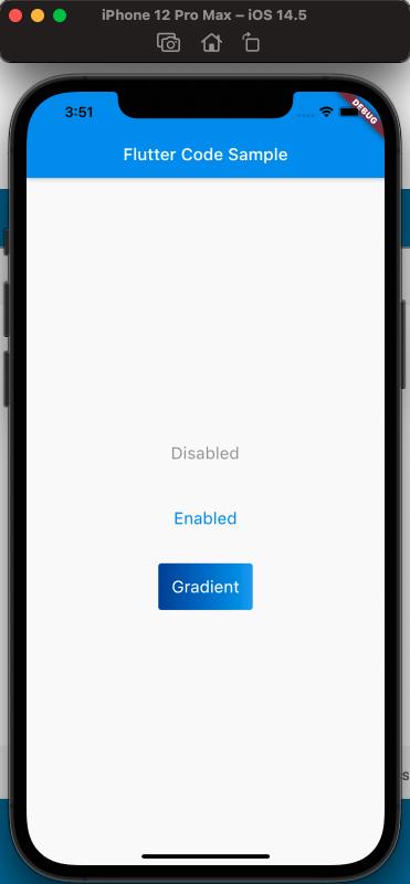
来看一下,定义三个按钮,分别对应,按钮不可点击,按钮可点击,按钮带有渐变背景,三种情况,效果如下:
使用代码如下:
class MyApp extends StatelessWidget {
  const MyApp({Key? key}) : super(key: key);

  static const String _title = 'Flutter Code Sample';

  @override
  Widget build(BuildContext context) {
    return MaterialApp(
        title: _title,
        home: Scaffold(
          appBar: AppBar(
            title: const Text(_title),
          ),
          body: const MyStatelessWidget(),
        ));
  }
}

class MyStatelessWidget extends StatelessWidget {
  const MyStatelessWidget({Key? key}) : super(key: key);

  @override
  Widget build(BuildContext context) {
    return Center(
      child: Column(
        mainAxisSize: MainAxisSize.min,
        children: [
          TextButton(
            onPressed: null,
            child: const Text('Disabled'),
            style: TextButton.styleFrom(
              textStyle: const TextStyle(fontSize: 20),
            ),
          ),
          const SizedBox(
            height: 30,
          ),
          TextButton(
            onPressed: () {},
            child: const Text('Enabled'),
            style: TextButton.styleFrom(
              textStyle: const TextStyle(fontSize: 20),
            ),
          ),
          const SizedBox(
            height: 30,
          ),
          ClipRRect(
            borderRadius: BorderRadius.circular(4),
            child: Stack(
              children: [
                Positioned.fill(
                  child: Container(
                    decoration: const BoxDecoration(
                      gradient: LinearGradient(
                        colors: [
                          Color(0xFF0D47A1),
                          Color(0xFF1976D2),
                          Color(0xFF42A5F5),
                        ],
                      ),
                    ),
                  ),
                ),
                TextButton(
                  onPressed: () {},
                  child: const Text('Gradient'),
                  style: TextButton.styleFrom(
                    padding: const EdgeInsets.all(16.0),
                    primary: Colors.white,
                    textStyle: const TextStyle(fontSize: 20),
                  ),
                ),
              ],
            ),
          )
        ],
      ),
    );
  }
}
注意渐变按钮的实现,使用了Stack。
ElevatedButton#
- ElevatedButton 的属性:
- autofocus
- child
- clipBehavior
- enabled
- focusNode
- key
- onLongPress
- onPressed
- style
代码如下:
class MyApp extends StatelessWidget {
  const MyApp({Key? key}) : super(key: key);

  static const String _title = 'Flutter Code Sample';

  @override
  Widget build(BuildContext context) {
    return MaterialApp(
        title: _title,
        home: Scaffold(
          appBar: AppBar(
            title: const Text(_title),
          ),
          body: const MyStatefulWidget(),
        ));
  }
}

class MyStatefulWidget extends StatefulWidget {
  const MyStatefulWidget({Key? key}) : super(key: key);

  @override
  State<MyStatefulWidget> createState() => _MyStatefulWidgetState();
}

class _MyStatefulWidgetState extends State<MyStatefulWidget> {
  @override
  Widget build(BuildContext context) {
    final ButtonStyle style =
        ElevatedButton.styleFrom(textStyle: const TextStyle(fontSize: 20));

    return Center(
      child: Column(
        mainAxisSize: MainAxisSize.min,
        children: [
          ElevatedButton(
              onPressed: null,
              child: const Text('Disabled'),
              style: style,
          ),
          const SizedBox(
            height: 30,
          ),
          ElevatedButton(
            onPressed: () {},
            child: const Text('Enabled'),
            style: style,
          )
        ],
      ),
    );
  }
}
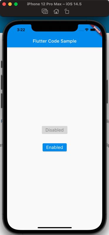
效果如下:
OutlinedButton#
- OutlinedButton 的属性如下:
- autofocus
- child
- clipBehavior
- enabled
- focusNode
- key
- onLongPress
- onPressed
- style
代码如下:
class MyApp extends StatelessWidget {
  const MyApp({Key? key}) : super(key: key);

  static const String _title = 'Flutter Code Sample';

  @override
  Widget build(BuildContext context) {
    return MaterialApp(
      title: _title,
      home: Scaffold(
        appBar: AppBar(
          title: const Text(_title),
        ),
        body: const Center(
          child: MyStatelessWidget(),
        ),
      ),
    );
  }
}

class MyStatelessWidget extends StatelessWidget {
  const MyStatelessWidget({Key? key}) : super(key: key);

  @override
  Widget build(BuildContext context) {
    return OutlinedButton(
        onPressed: () {
          print('Received Click');
        },
        child: const Text('Click Me'));
  }
}
样式如下:
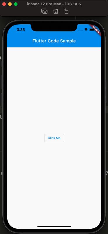
Ps: 可以试一下点击效果!
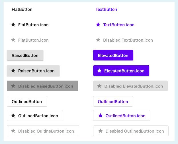
各个 Button 样式的对比:
参考#
Text Button Api Doc
ElevatedButton Api Doc
OutlinedButton Api Doc
RaisedButton vs ElevatedButton, FlatButton vs TextButton and OutlineButton vs OutlinedButton