Flutter 组件基础 ——Text#
组件#
文本组件:Text Widget#
Text 是文本组件,类似于 iOS 中 UILabel,用于文本的展示,是布局的基础控件之一。
文本对齐方式:TextAlign#
- TextAlign
- center:Align the text in the center of the cotainer
- left:Align the text on the left edge of the container
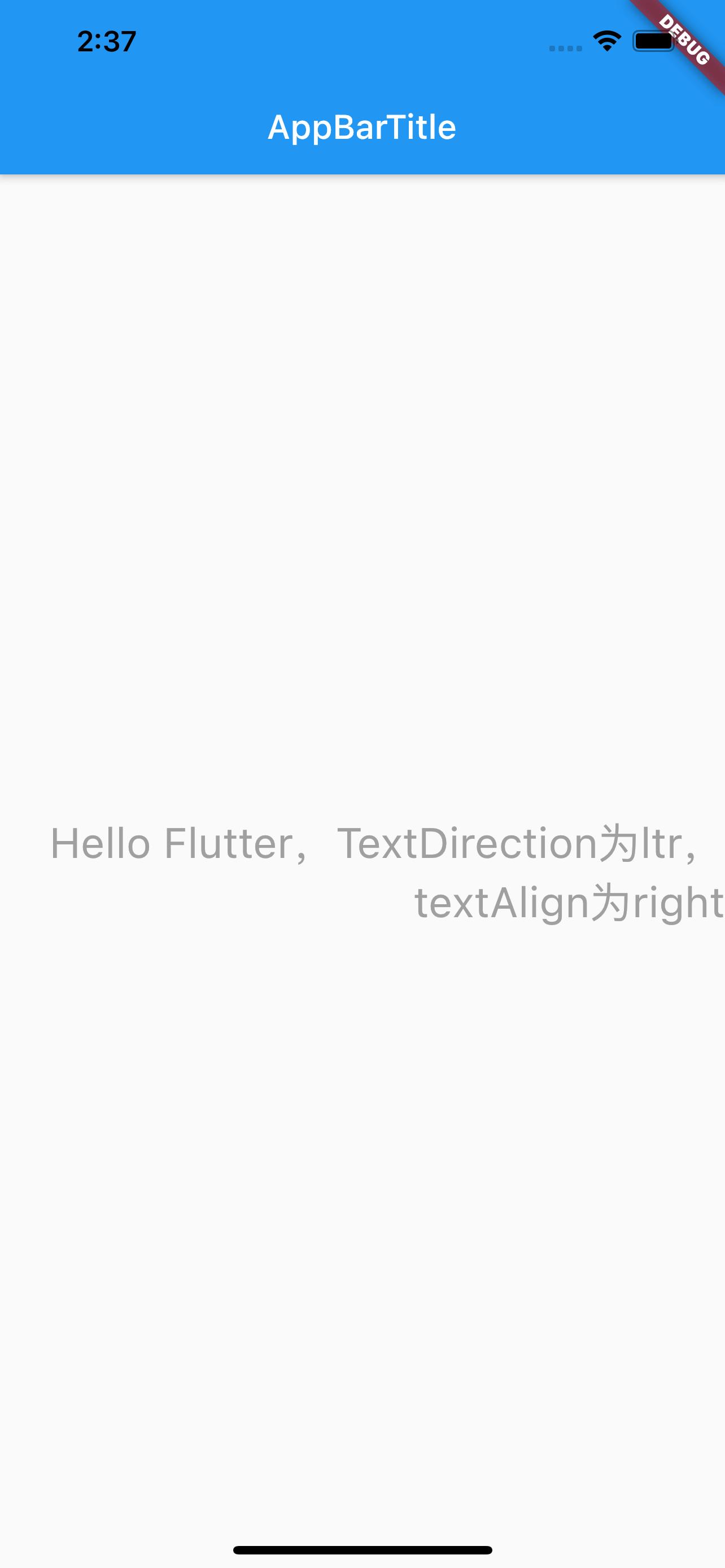
- right:Align the text on the right edge of the container
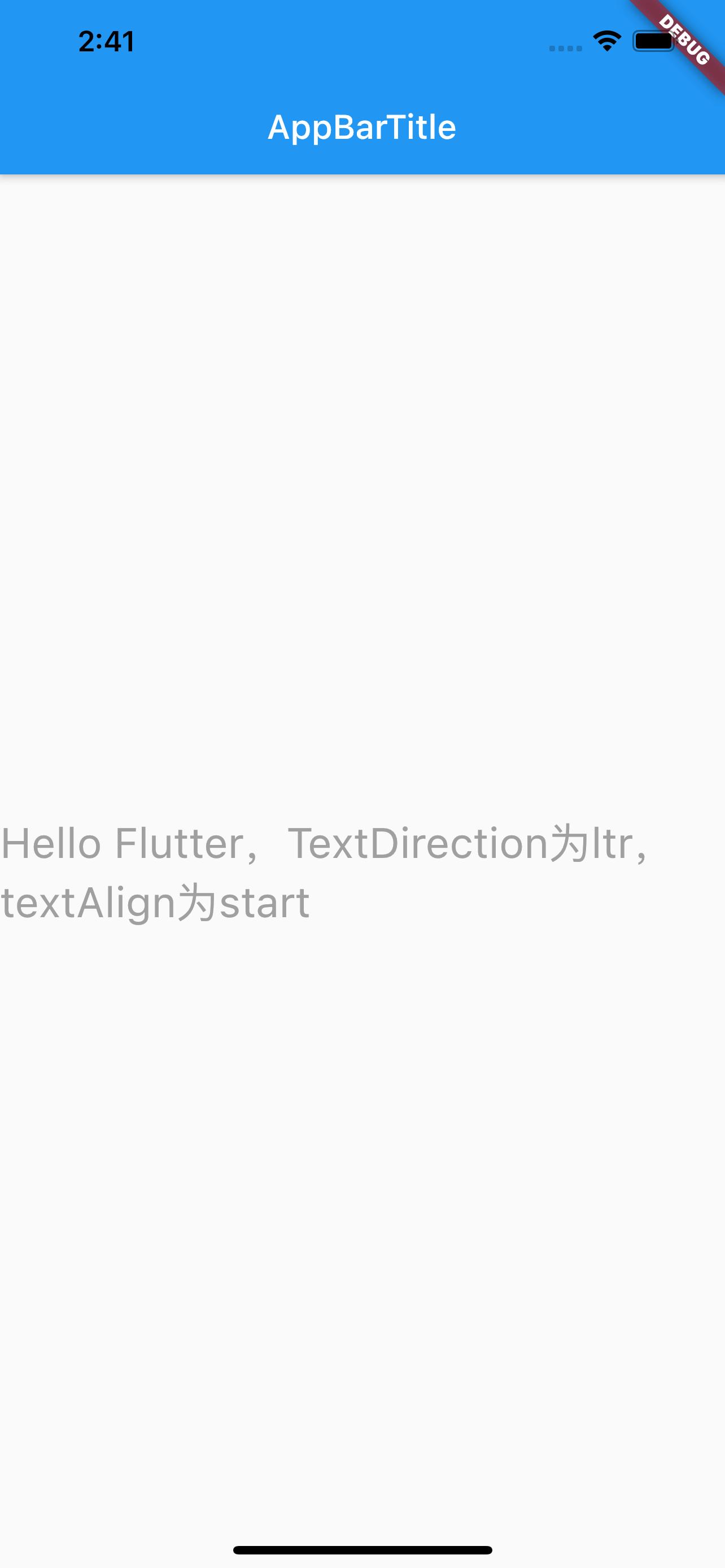
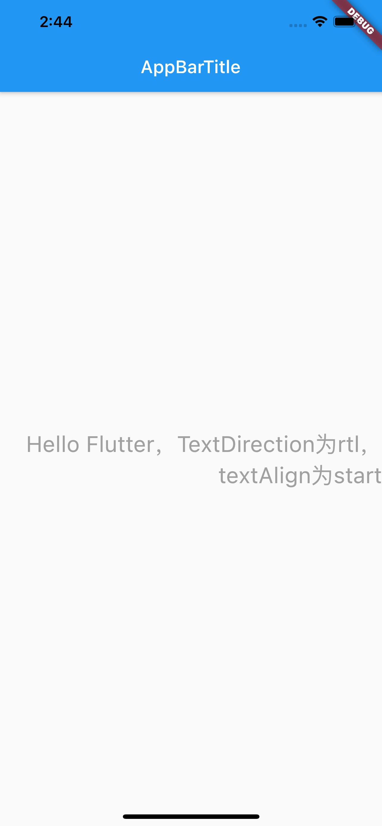
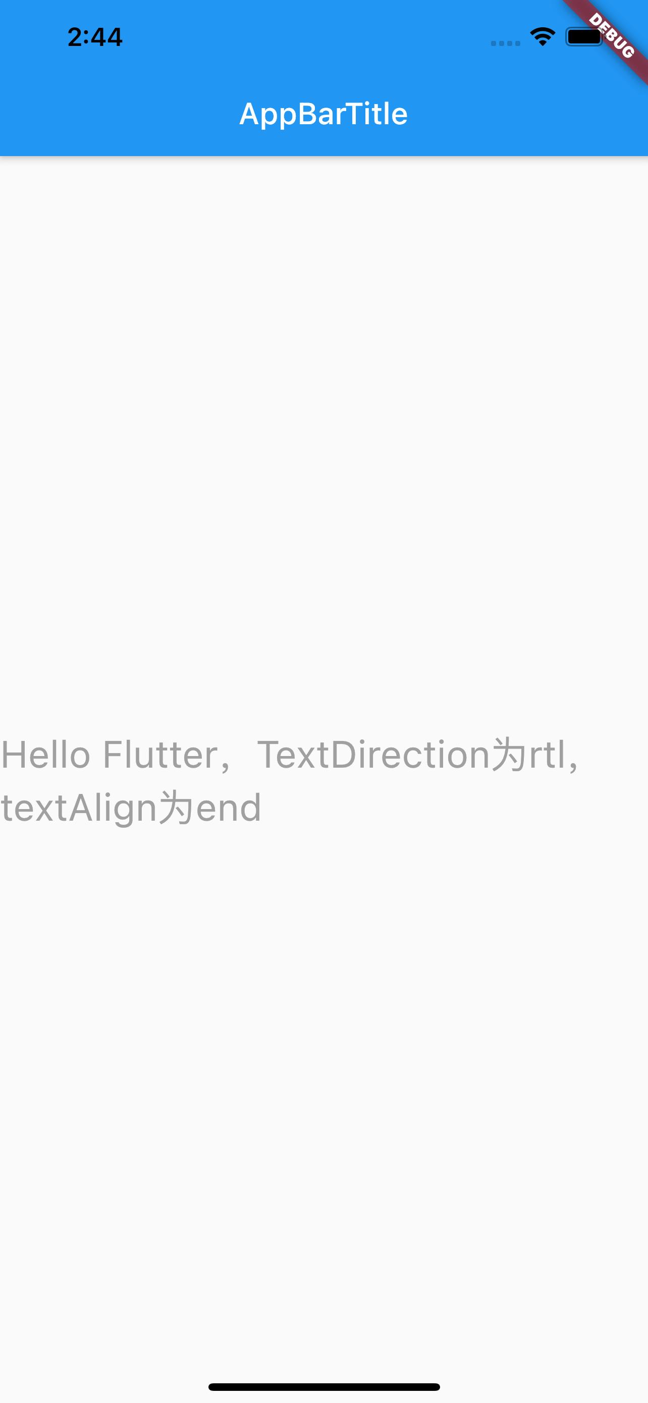
- start:Align the text on the leading edge of the container. For left-to-right text(TextDirection.ltr), this is the left edge. For the right-to-left text(TextDirection.rtl), this is the right edge.
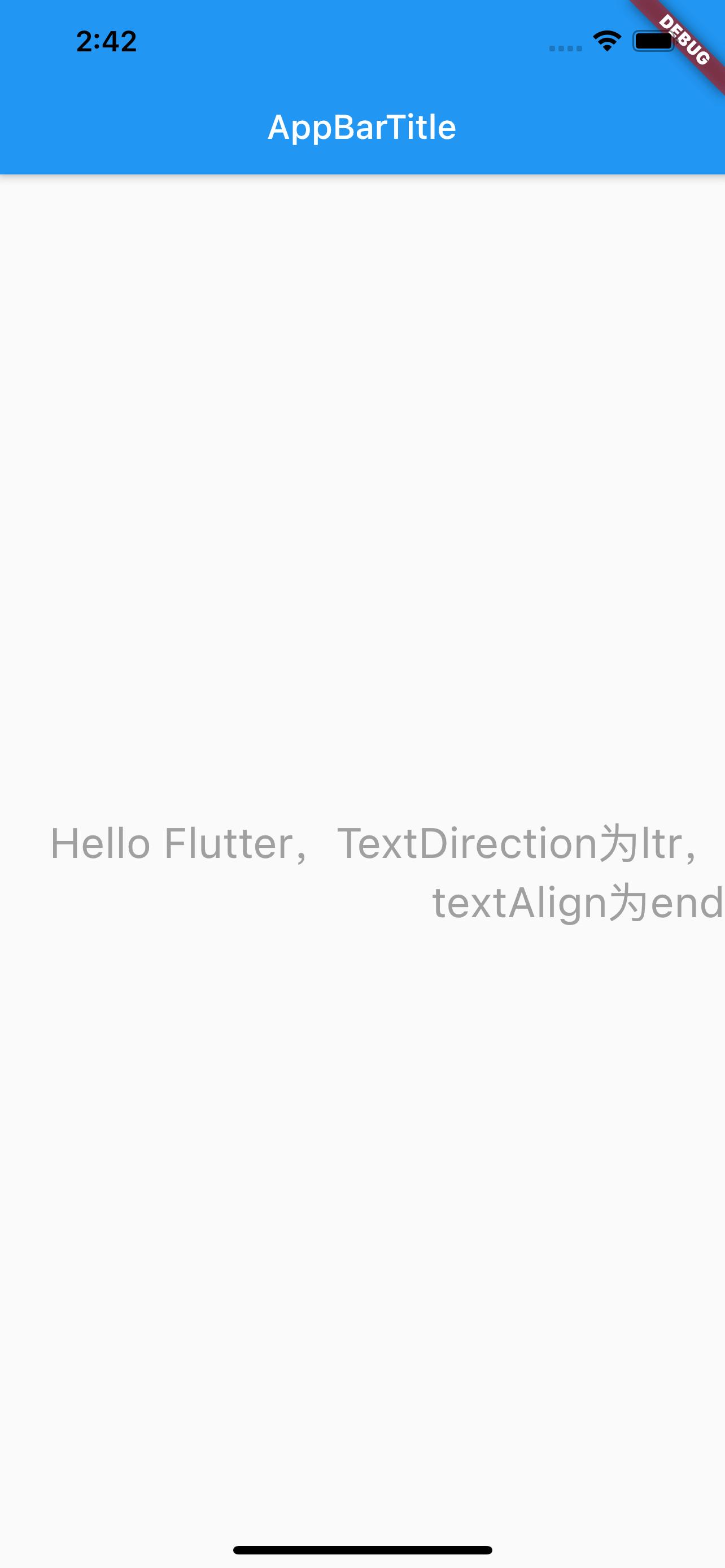
- end:Align the text on the trailing edge of the container. For left-to-right text, this is the right edge. For the right-to-left text, this is the left edge.
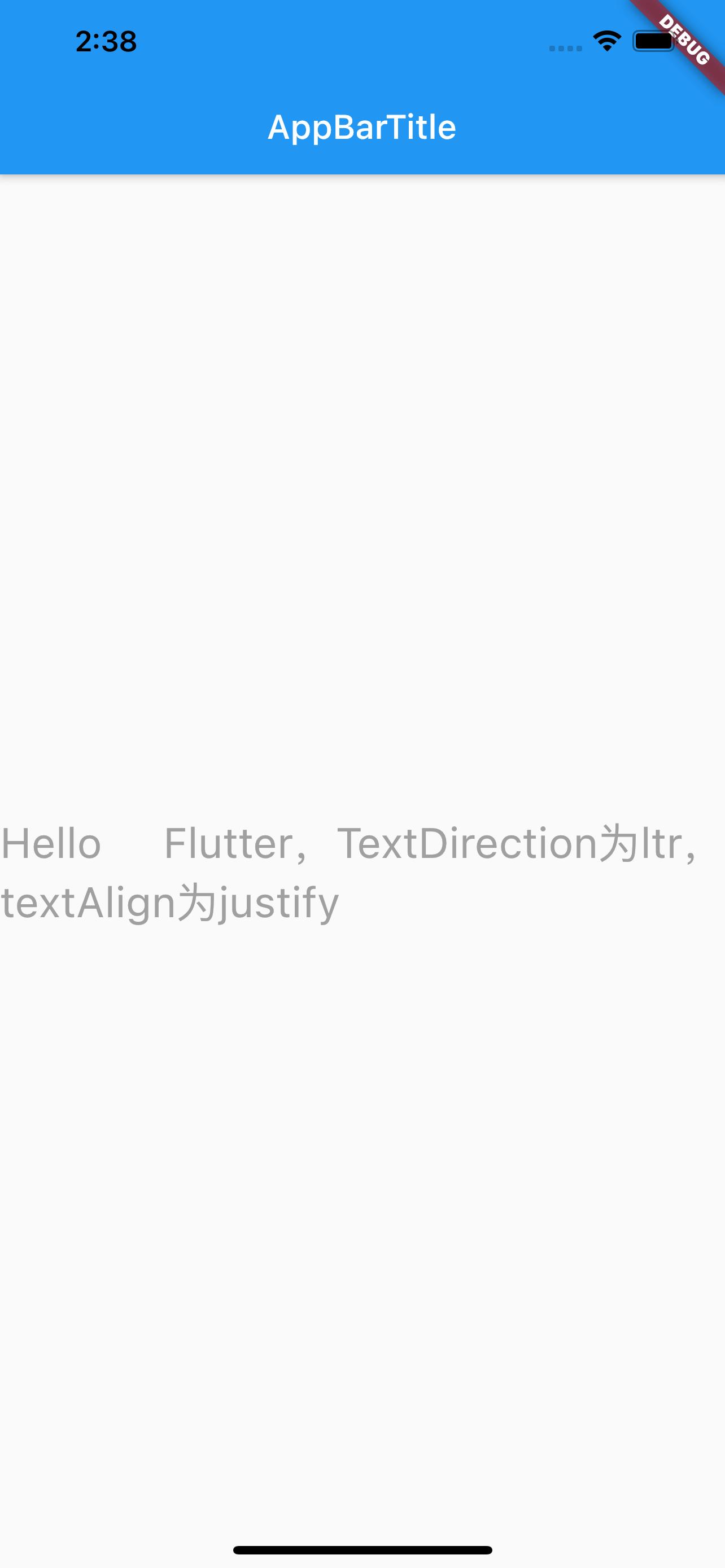
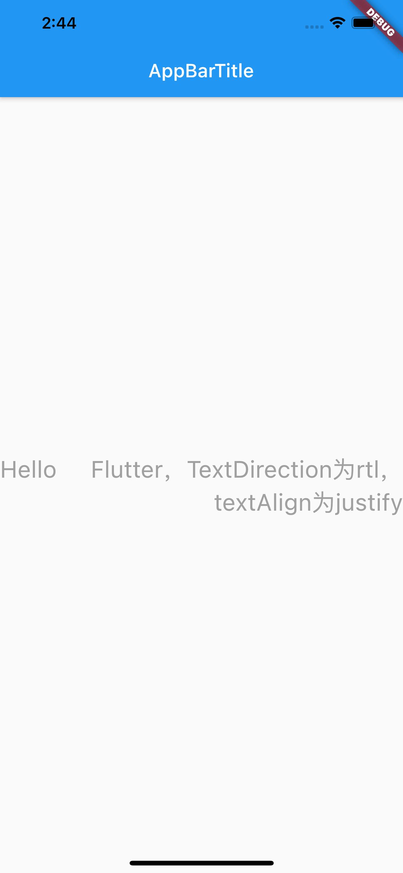
- justify:Stretch lines of text that end with a soft line break to fill the width of the container. Lines that end with hard line breaks are aligned towards the start edge.
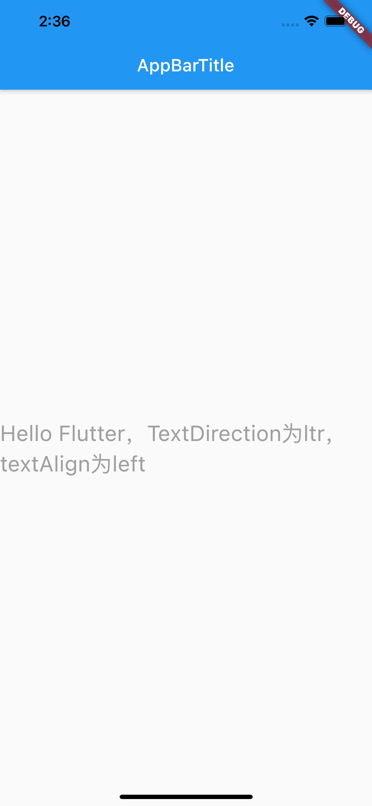
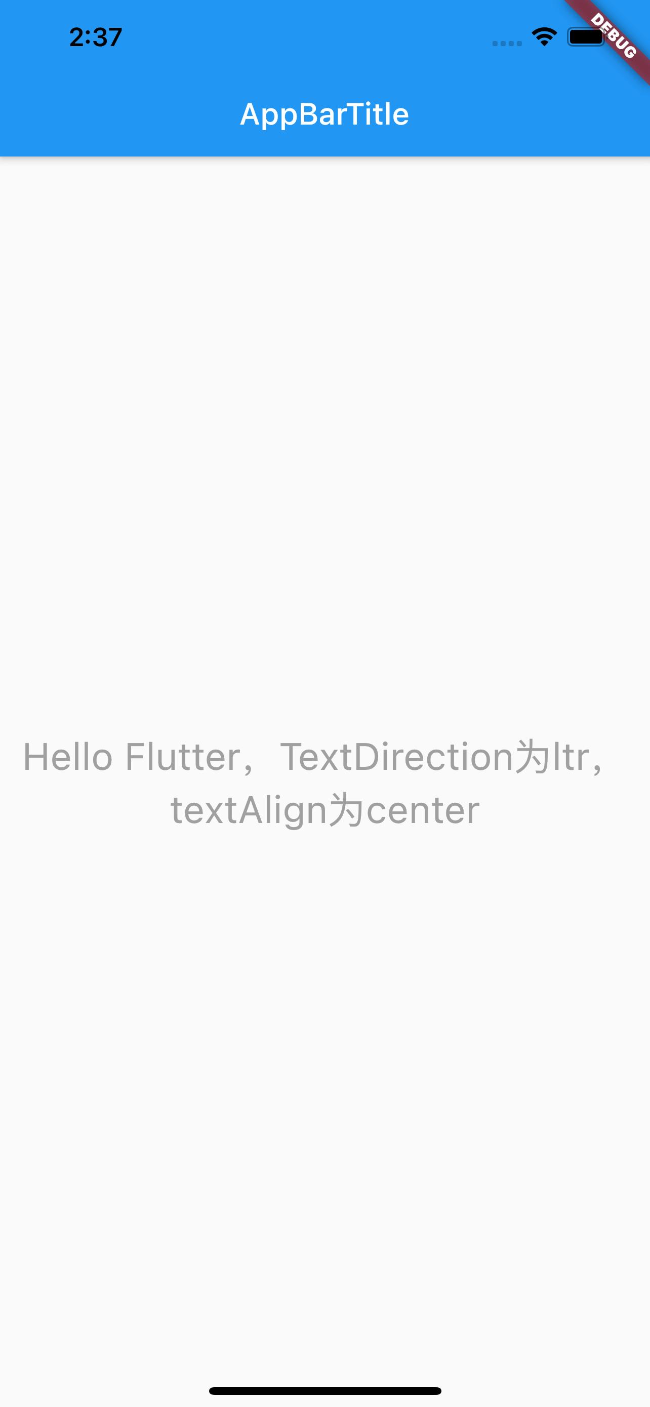
总结:TextAlign.center居中对齐,left 左对齐,right 右对齐,start 和 end 的含义取决于 TextDirection,当 TextDirection 为 ltr 即 (left-to-right) 时,start 和 end 的含义同 left 和 right 一致。当 TextDirection 为 rtl 即 (right-to-left) 时,start 和 end 的含义和 left、right 相反。justify 不生硬的换行(好吧,我翻译不了,看下图吧)
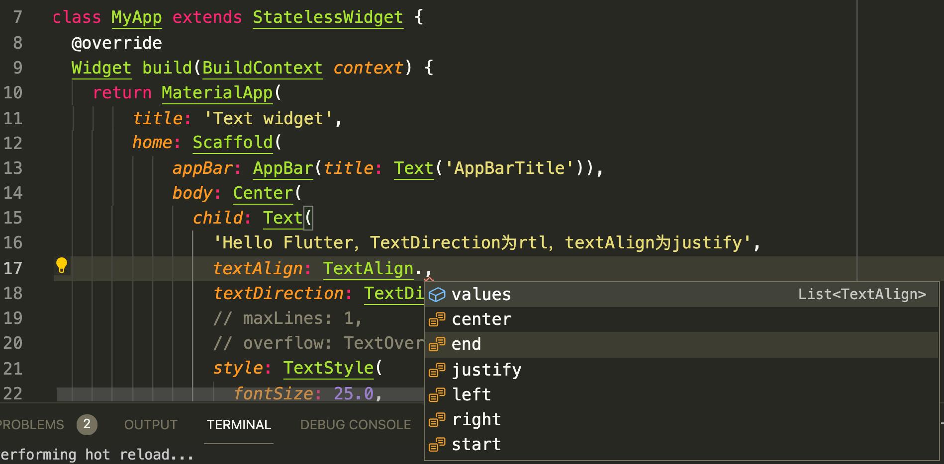
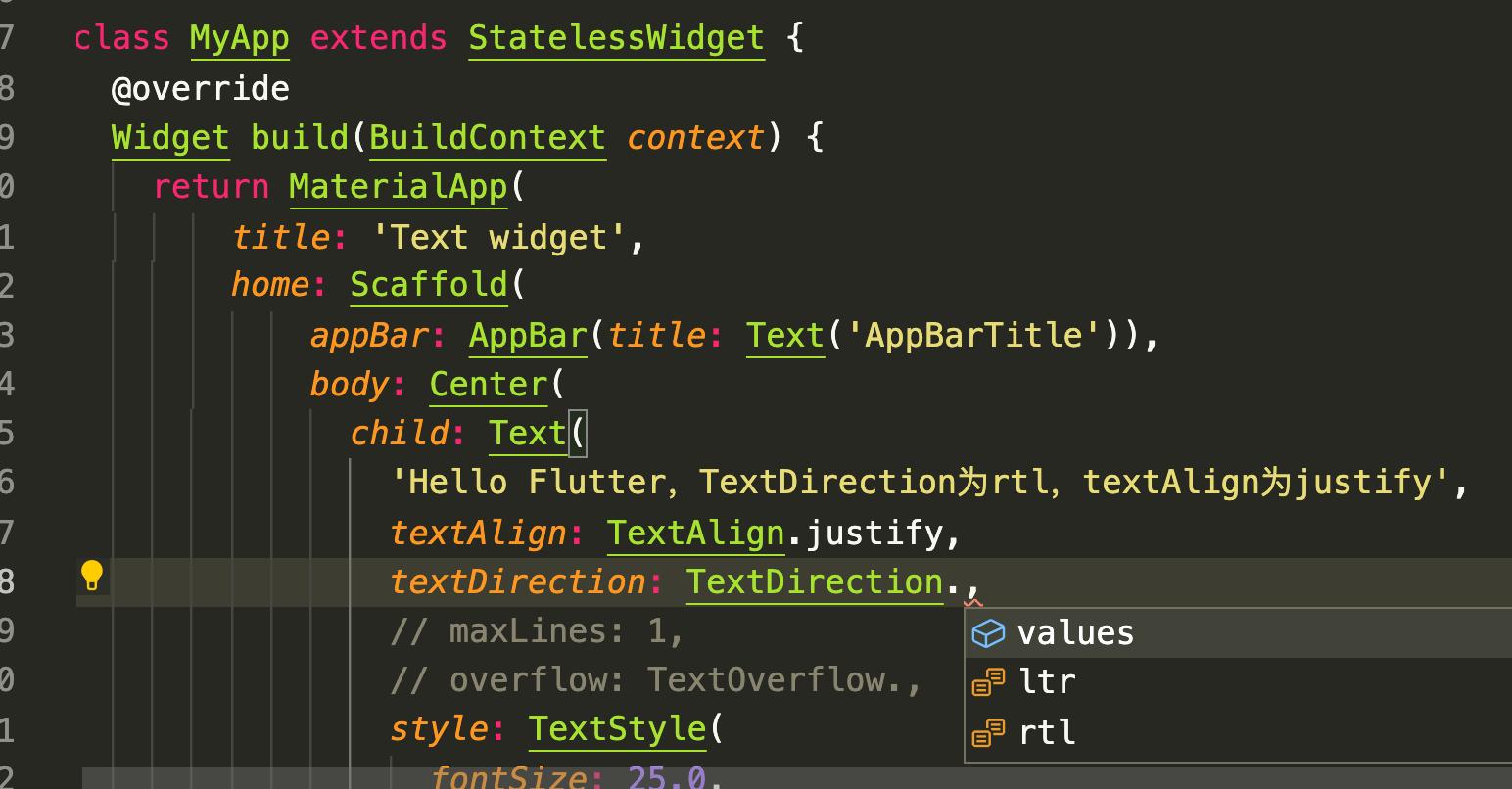
class MyApp extends StatelessWidget {
  @override
  Widget build(BuildContext context) {
    return MaterialApp(
        title: 'Text widget',
        home: Scaffold(
            appBar: AppBar(title: Text('AppBarTitle')),
            body: Center(
              child: Text(
                'Hello Flutter,TextDirection为rtl,textAlign为justify',
                textAlign: TextAlign.justify,
                textDirection: TextDirection.ltr,
                // maxLines: 1,
                // overflow: TextOverflow.,
                style: TextStyle(
                  fontSize: 25.0,
                  color: Color.fromARGB(255, 160, 160, 160),
                  // decoration: TextDecoration.lineThrough,
                  // decorationStyle: TextDecorationStyle.solid,
                ),
              ),
            )));
  }
}
文本排列方向 textDirection#
textDirection 类似于 H5 中的 'row-reverse' 的概念,影响的是 textAlign 中的 start、end 和 justify 属性。
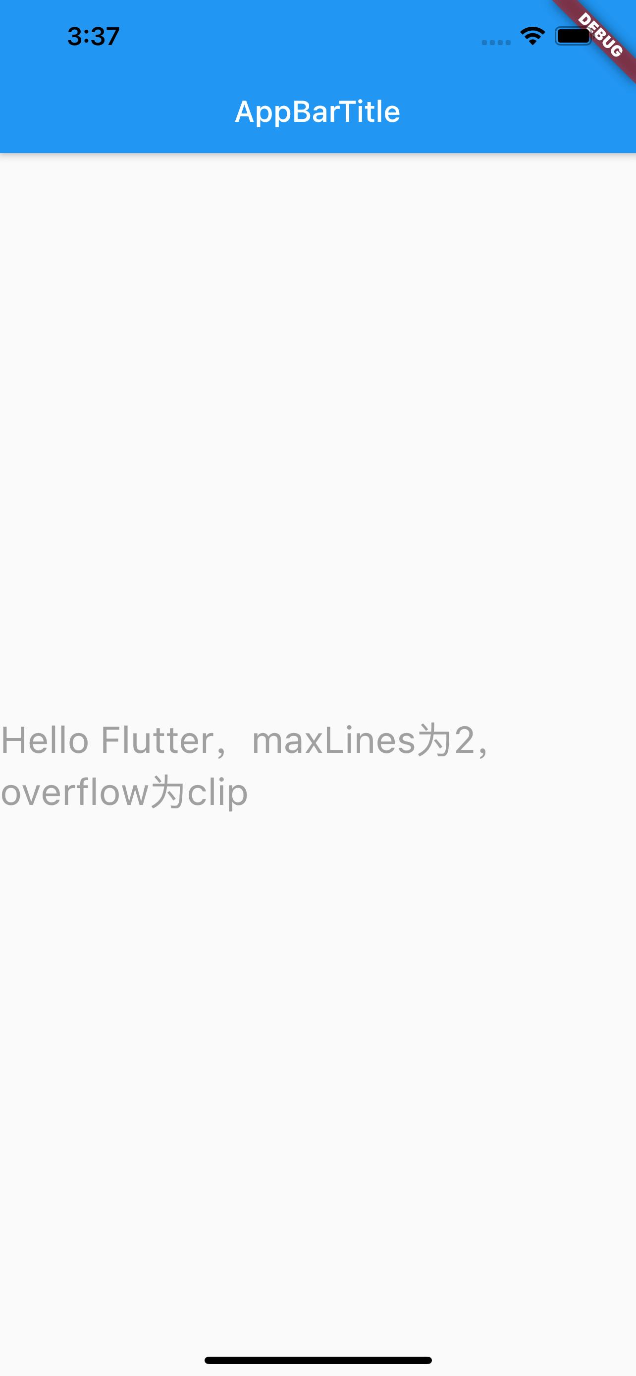
最大行数 maxLines#
注意 iOS 中设置 label 不限行数是设置numberOfLines=0,但 Flutter 中最大行数maxLines不能为 0,如果设置不限行数,不设置这个属性即可。
超出显示 overFlow#
overFlow 类似于 iOS 中的 lineBreakMode,设置超出指定行数之后的显示方式:截断、省略...
需要注意的是,是超出指定行数之后的显示,所以需要先设置 maxLines,如果不设置,默认是无限行,设置这个属性就没有意义。
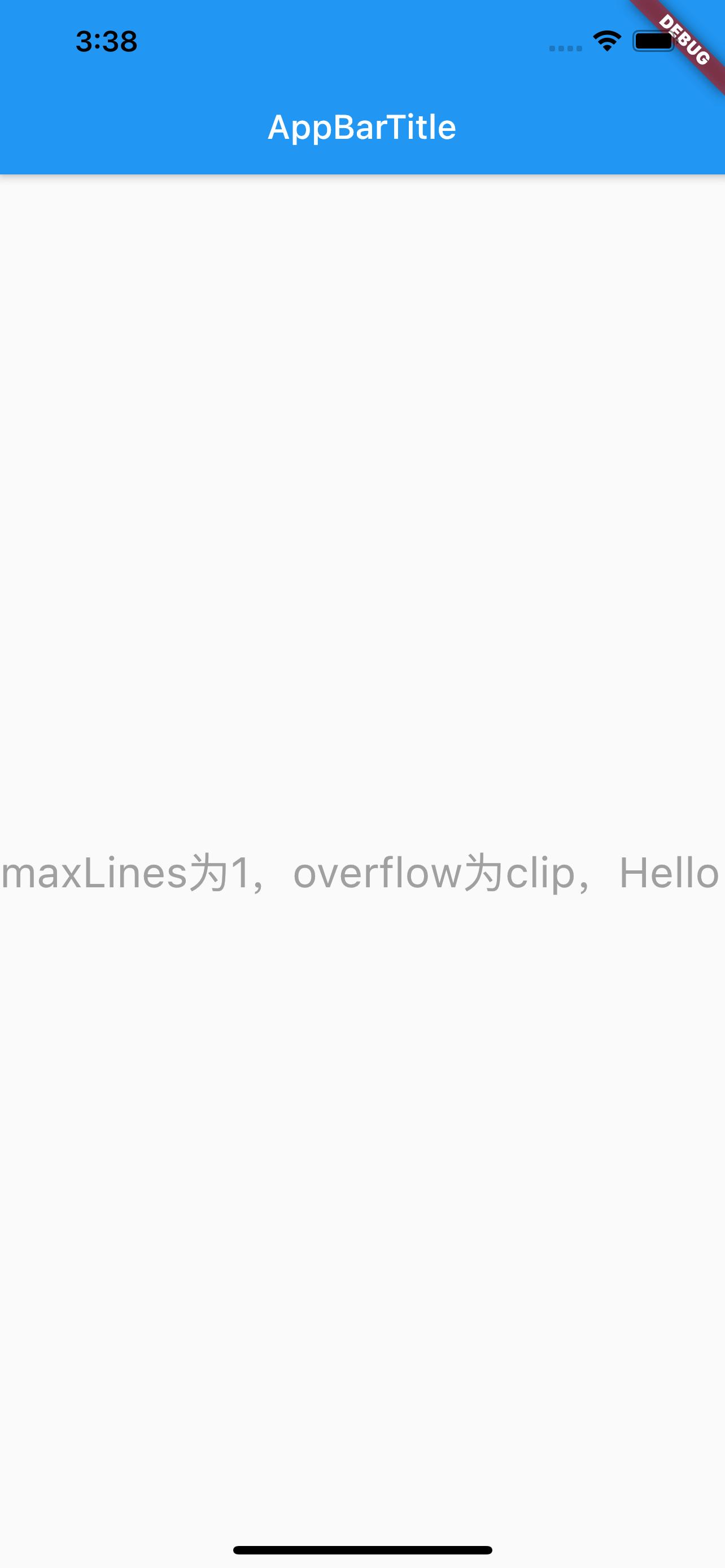
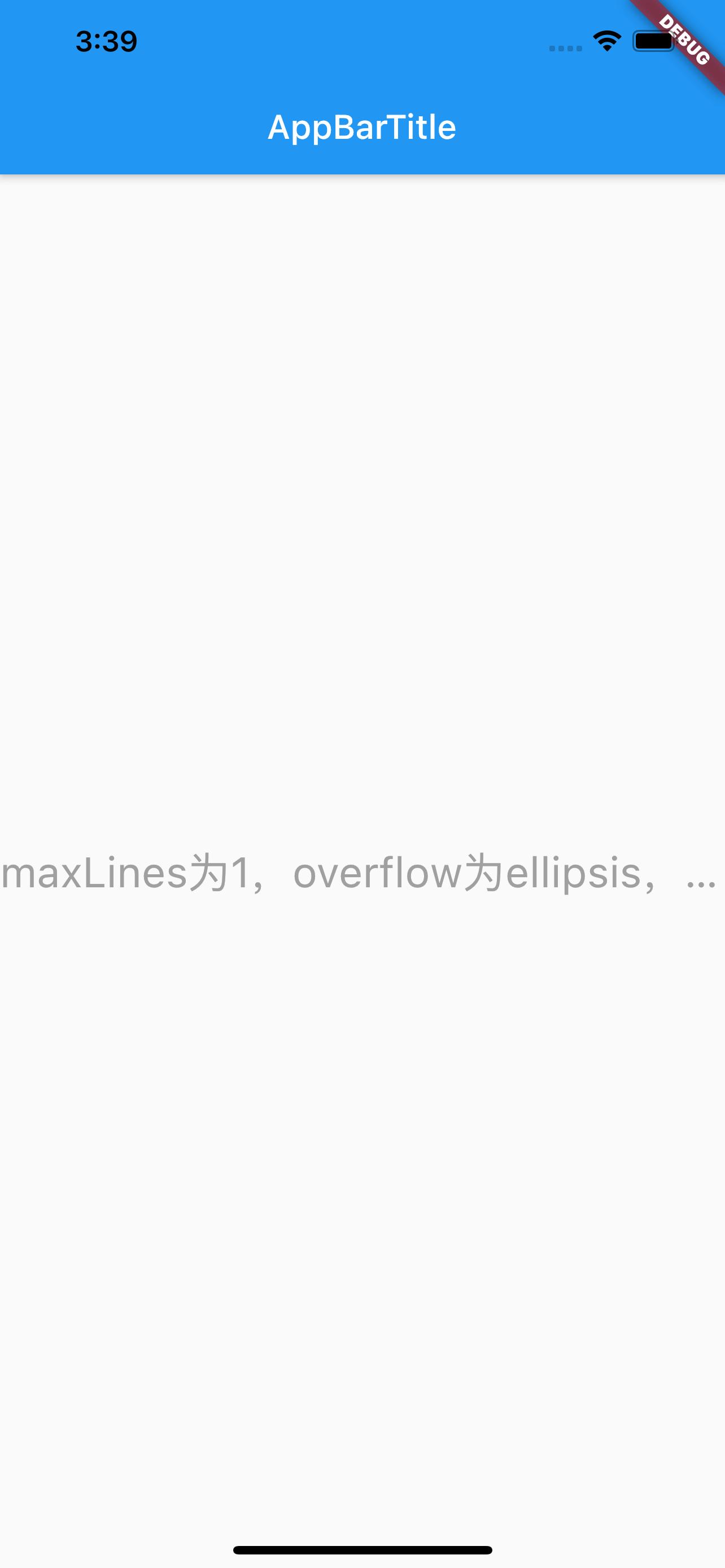
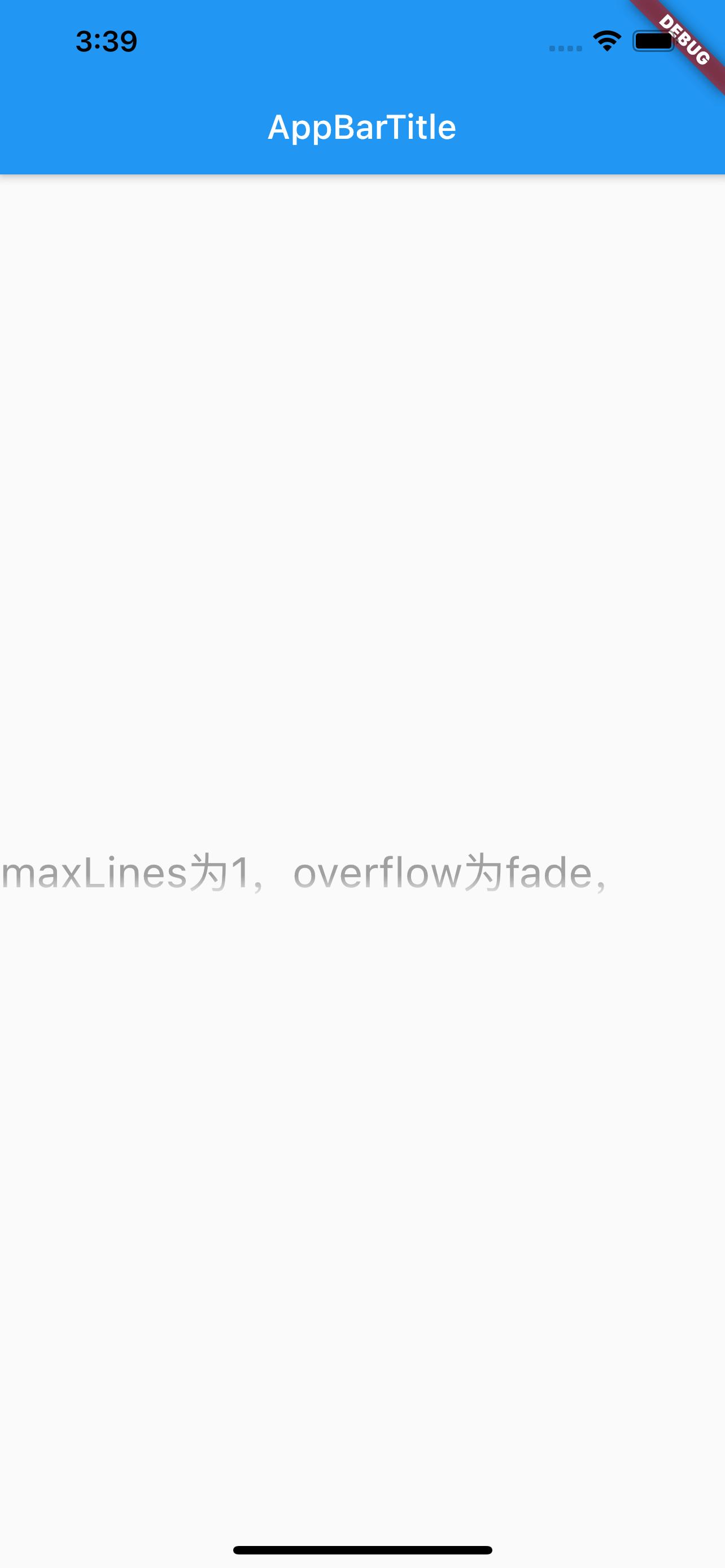
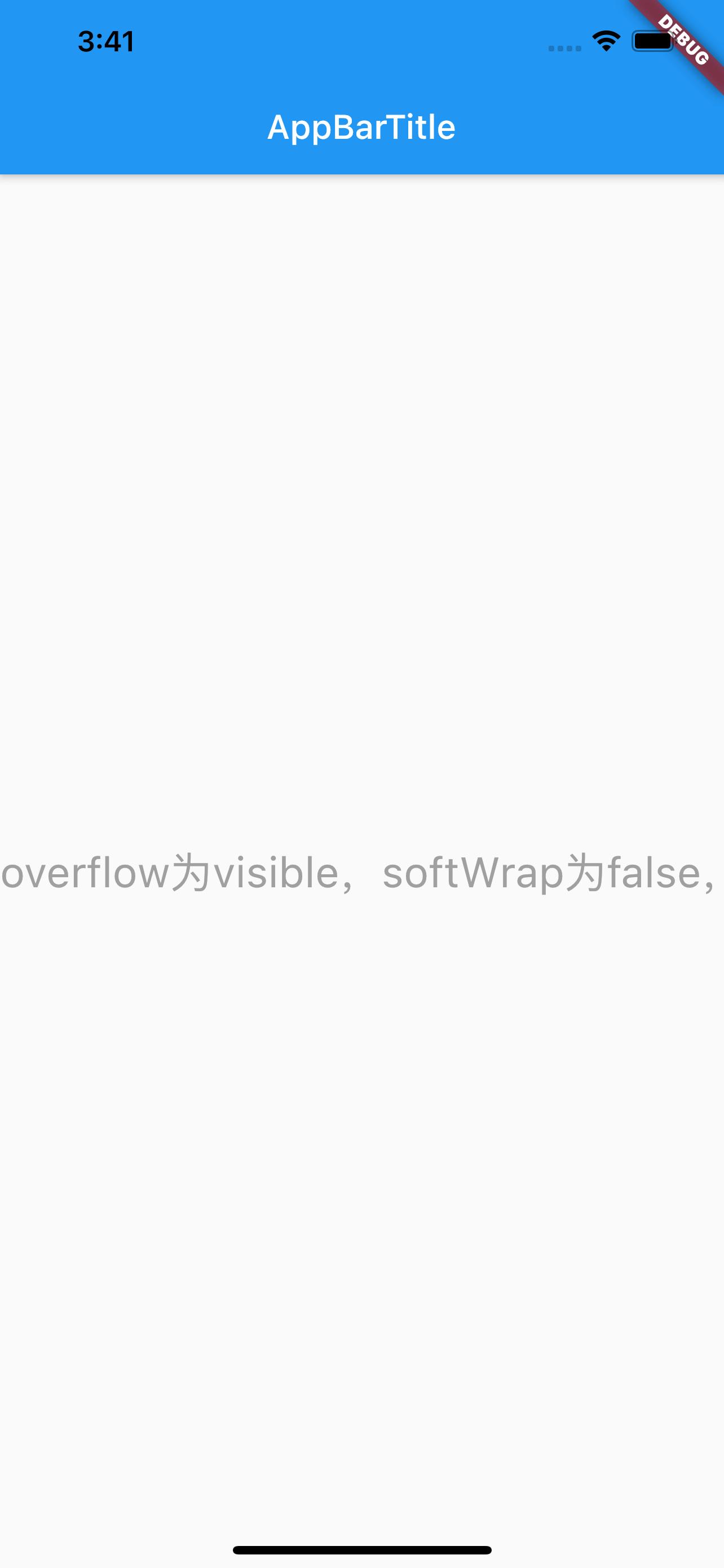
- overFlow
- clip:Clip the overflowing text to fix its container
- ellipsis:Use an ellipsis to indicate that the text has overflowed
- fade:Fade the overflowing text to transparent
- visible:Render overflowing text outside of its container
clip 超出之后截断,ellipsis 超出之后显示省略,fade 超出之后尾部显示渐变消失,visible 超出之后还渲染。见下图。
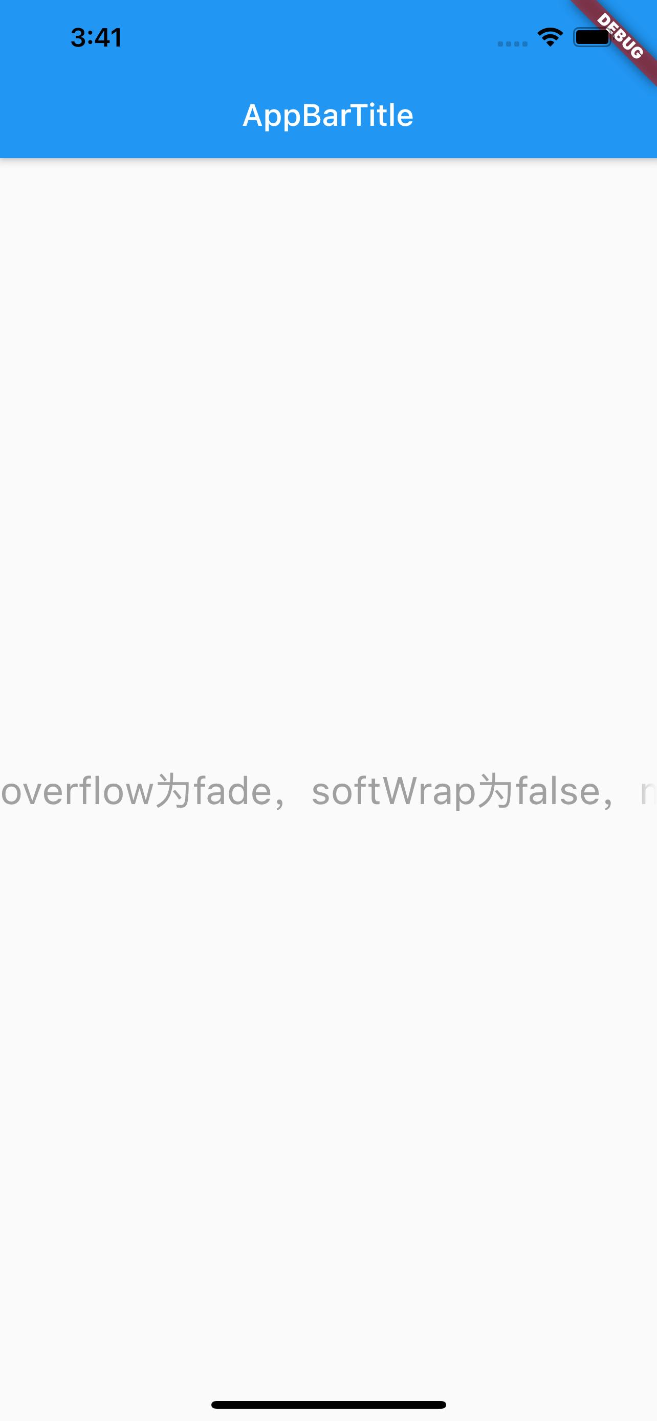
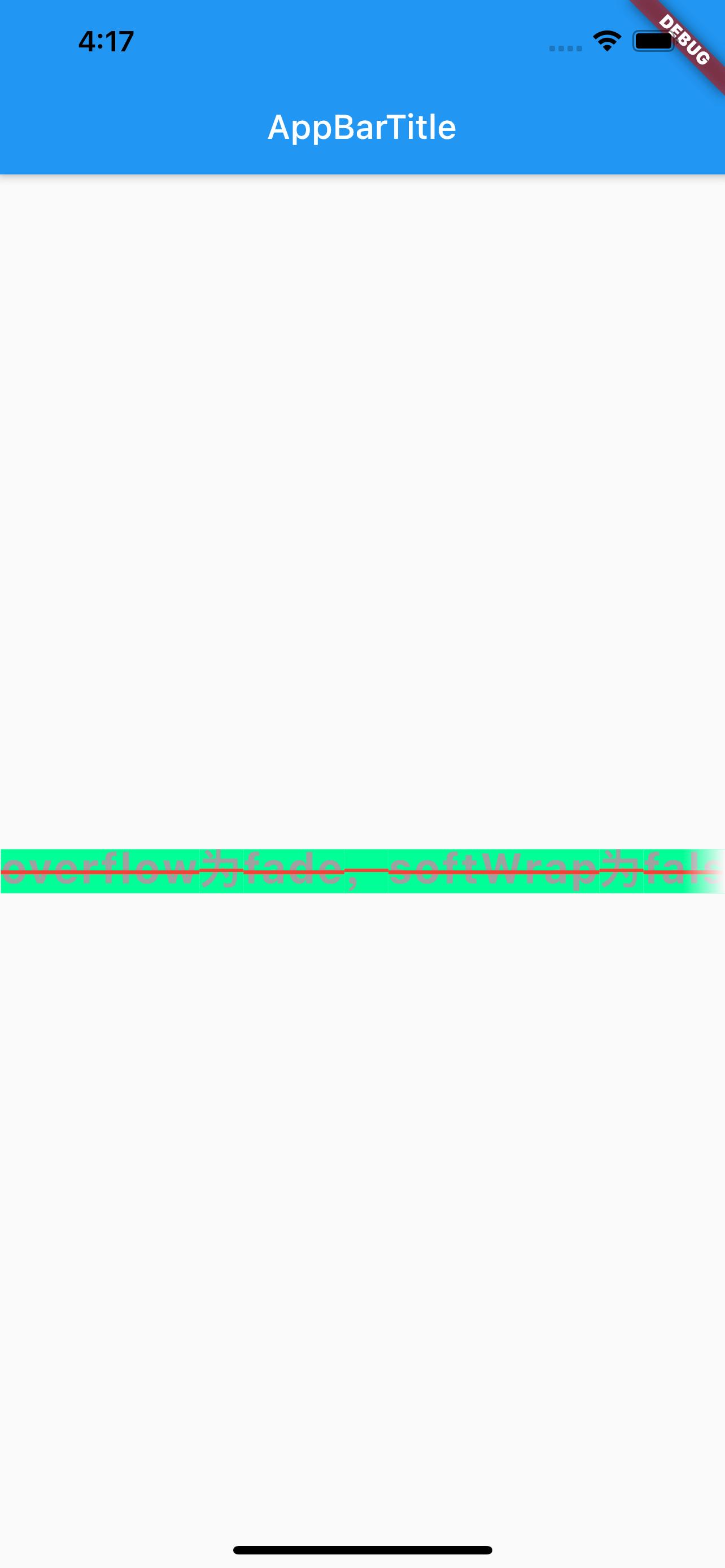
此处需要注意,overFlow 为 fade 时,设置 softWrap 为 false 与不设置的效果,不设置时阴影效果方向为从上到下,设置了之后阴影效果为超出的尾部,见下图。
style 属性#
style 属性,可设置背景颜色、字体大小、字体类型和颜色、下划线样式和颜色、高度、字间距等等,具体可参考Flutter TextStyle Doc文档,常用的属性如下
- TextStyle
- backgroundColor:背景颜色
- color:字体颜色
- decoration:装饰线类型
- none:无
- overline:文本顶部
- lineThrough:文本中间
- underline:文本底部
- decorationColor:装饰线颜色
- decorationStyle:装饰线样式
- fontFamily:字体
- fontSize:字体大小
- fontStyle:字体类型
- italic:斜体
- normal:正常
- fontWeight:字体粗细
- height:文本每行之间的高度,取值范围(1~2)
- letterSpacing:文本之间的间距
使用如下:
class MyApp extends StatelessWidget {
  @override
  Widget build(BuildContext context) {
    return MaterialApp(
        title: 'Text widget',
        home: Scaffold(
            appBar: AppBar(title: Text('AppBarTitle')),
            body: Center(
              child: Text(
                'overflow为fade,softWrap为false,maxLines为1,Hello Flutter',
                textAlign: TextAlign.left, // 文本对齐方式
                textDirection: TextDirection.ltr, // 文本对齐方向
                maxLines: 1, // 最大显示多少行
                overflow: TextOverflow.fade, // 超出最大行数后效果
                softWrap: false,
                style: TextStyle(
                  backgroundColor: Color.fromARGB(255, 0, 255, 150), // 背景颜色
                  fontSize: 25.0, // 字体大小
                  fontStyle: FontStyle.normal, // 字体样式
                  fontWeight: FontWeight.bold, // 字体粗细
                  letterSpacing: 1.0, // 文本艰巨
                  height: 1, // 文本每行之间的高度,取值范围(1~2)
                  color: Color.fromARGB(255, 160, 160, 160), // 字体颜色
                  decoration: TextDecoration.lineThrough, // 装饰线类型
                  decorationStyle: TextDecorationStyle.solid, // 装饰线样式
                  decorationColor: Colors.red, // 装饰线颜色
                ),
              ),
            )));
  }
}
效果如下:
参考#
Flutter Api Doc
Flutter TextStyle Doc
Flutter 免费视频第二季 - 常用组件